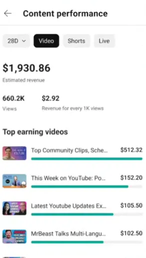
YouTube’s updating the way that it displays how much revenue your videos are earning in the app, with new listings in the YouTube Studio app that’ll show you your top-earning videos in each category, including separate tabs for Shorts, VODs, and Live uploads.

As you can see in this example, the updated format will now make it easier for creators to see, at a glance, which of their videos are earning them the most money, which could help to guide future content decisions geared around maximizing your revenue opportunities.
It’s a simple change, but it could have some impact on content planning, based around more data-informed decisions relating to your content strategy.
On another front, YouTube’s also trying out variable layouts in the web version of the app.
“We’re testing different layouts to the desktop watch experience to make it even easier to find related videos and engage with comments. These updates are currently being tested with a small group of users. If you’re in this experiment, you may notice that the position of features like comments, the video description, and recommended videos to watch next have changed.”
So, if YouTube looks a little different on desktop in the coming weeks, this is why. YouTube hasn’t provided any examples to show how significant, or not, the tested changes will be.
YouTube says that it’s testing the new formats with a selection of users.